Re-branding
Featured, Parents' Place of MD
THE LOGO:
In a sea of crayon-styled typefaces and arms-outstretched dancing children, PPMD needed a logo that would position themselves as a confident leader in their field. This logo utilizes positive/negative space in its icon to illustrate a nurturing and supportive environment.
THE IDENTITY PACKAGE:
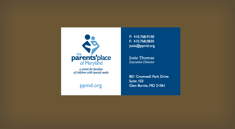
Along with a bold and modern logo, this company needed an identity package to position itself as a leader amongst its competitors. A clean and modern design commands confidence in the brand while bold blocks of color grab attention.
EVENT PROMOTIONS:
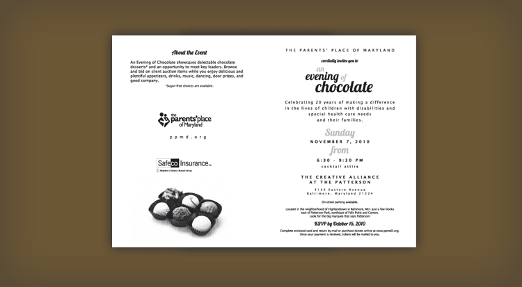
The Parent’s Place of Maryland needed an invitation as rich as the chocolate being sampled at their event. The evening celebrated 20 years of making a difference in the lives of children with disabilities and special health care needs and their families.
The WEBSITE:
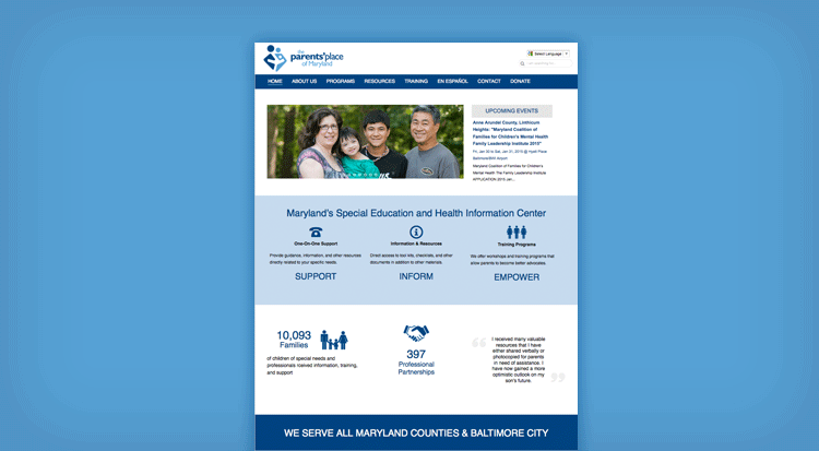
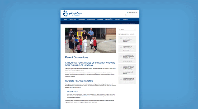
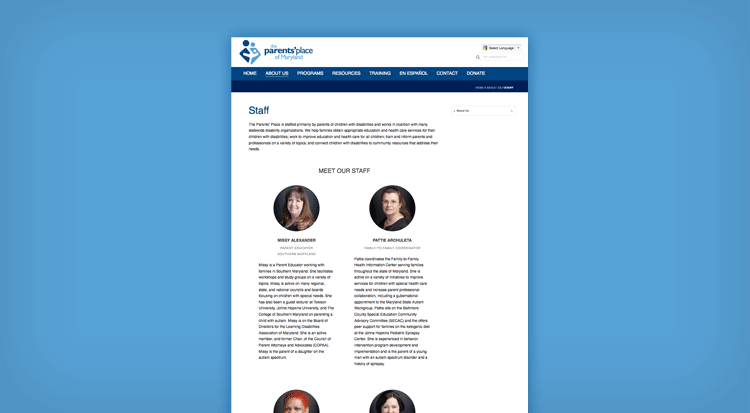
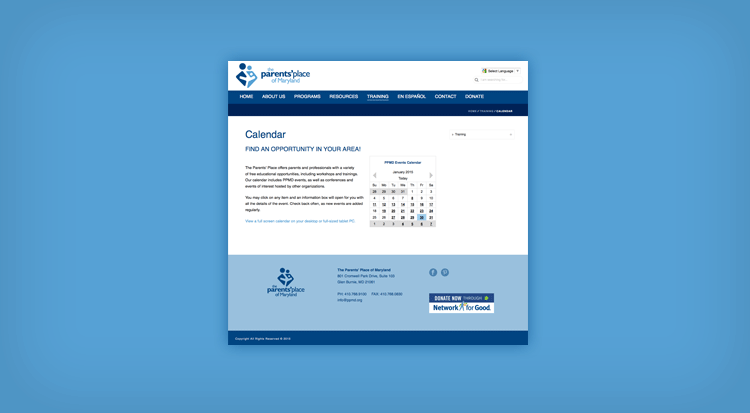
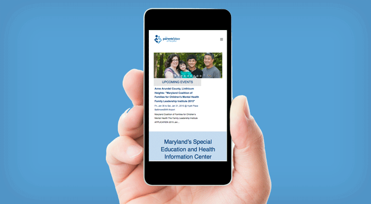
Accessible for its clients and updateable by its staff were the top priorities for this websites upgrade. This website design needed to utilize the WordPress CMS platform and perform optimally in a responsive mobile-ready environment. The design and content also prioritize 508 compliance.
Visit Website:
http://ppmd.org


